Tattoo-Fest
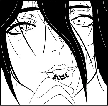
This was for a final project that was assigned to make advertising for a fake event. I wanted to do something unique and interesting so I chose to do a tattoo event. I had gone through many ideas and drafts of logos and imagery, but when I thought of a woman holding down her lip with “tattoo fest” tatted I knew I had to run with it. Though eventually, it became the year of the event to be more legible, I think it excels in conveying the feeling of an event for tattoos. The top four poster designs were drafts I created to see what design style I’d continue with, I chose one that kept it minimal.
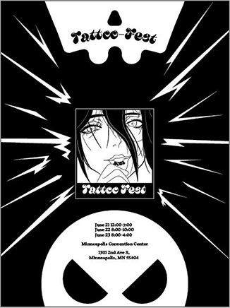
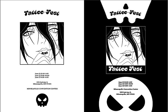
These four posters were my drafting process. I started with a ton of detail with the excess lightning bolts and shapes, moving to a far more streamlined design that conveyed information efficiently with distinct imagery that wasn’t distracting. The final designs of this project are unlike any other project I’ve worked on, but the cohesion of design language makes it one of my favorite projects.
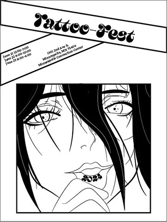
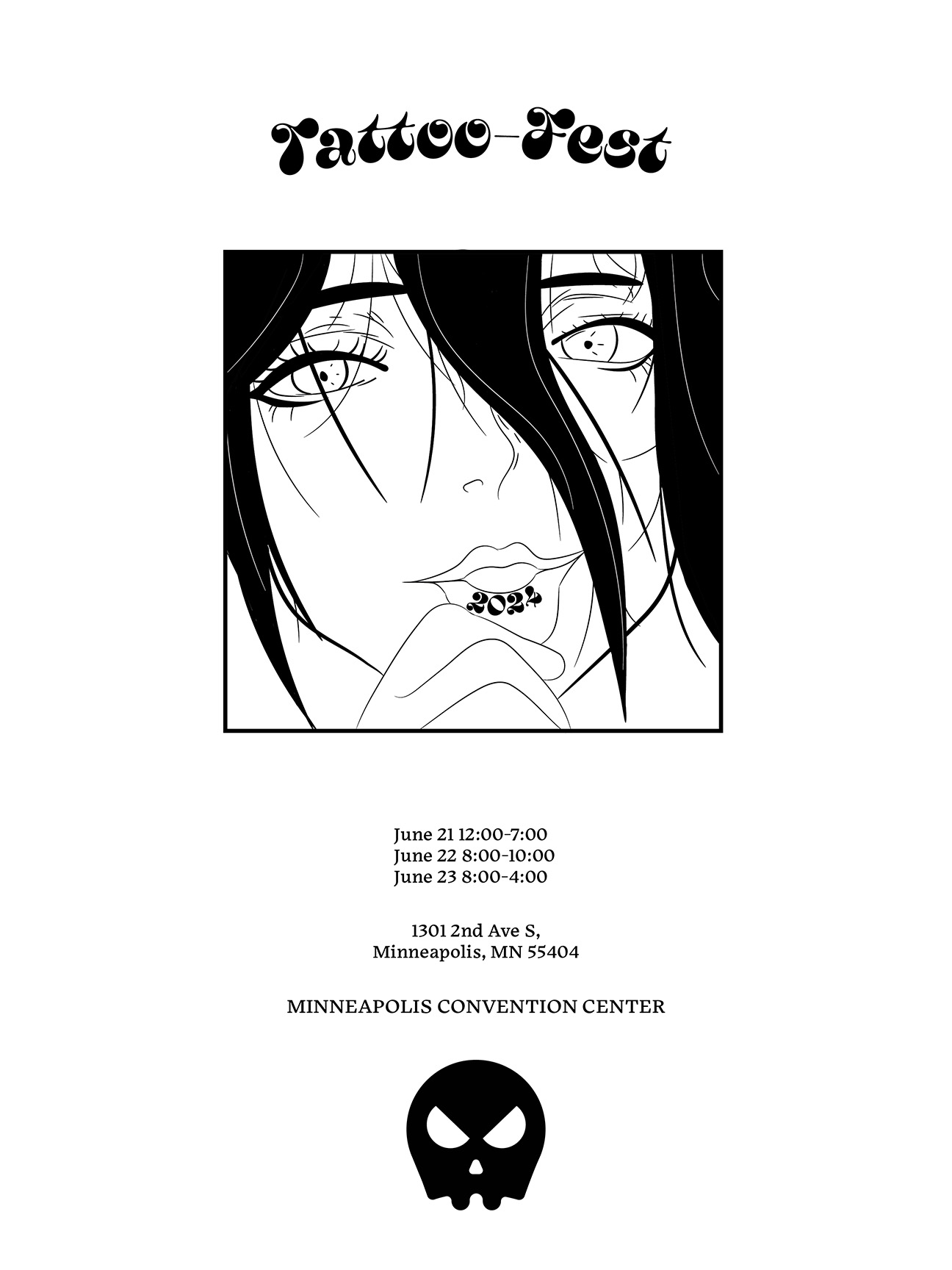
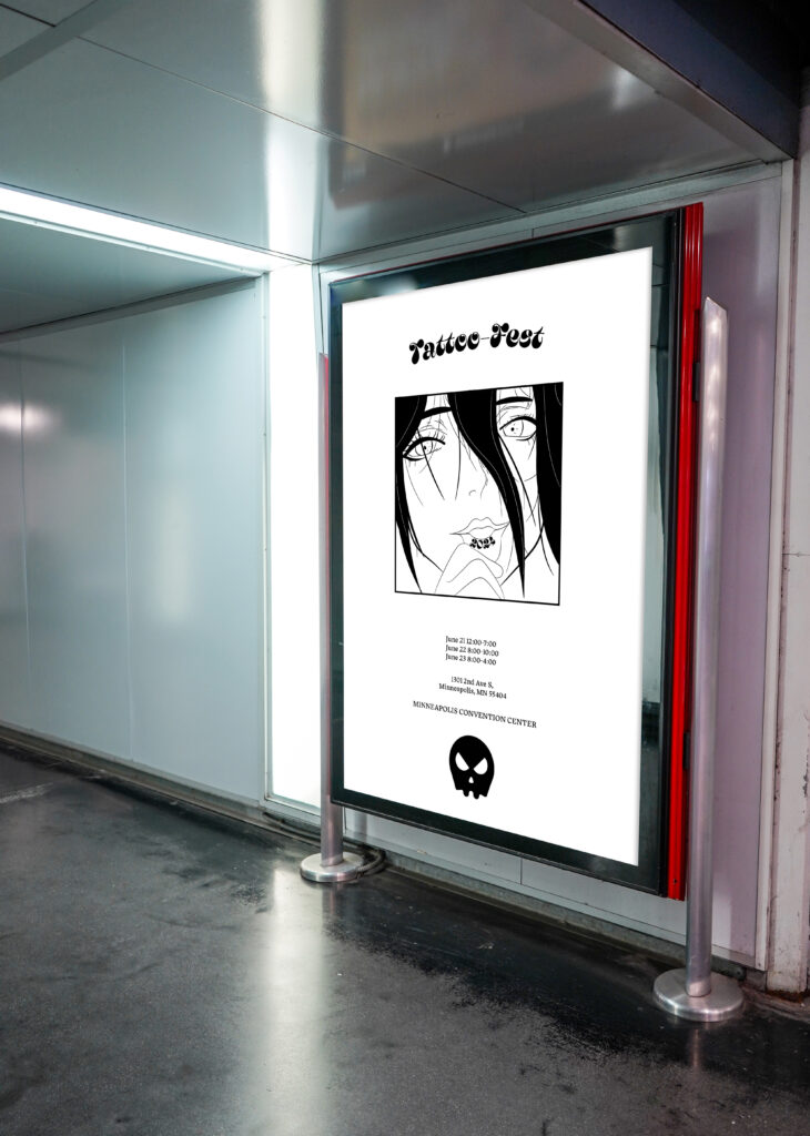
The final poster and mockup show the effective-simplicity of the final design. I think it’s both attention-grabbing and easily legible.
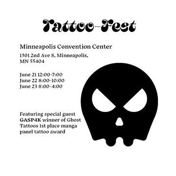
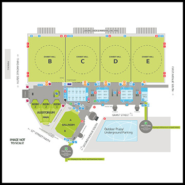
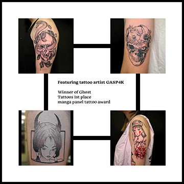

This was the brochure I created for the event. It’s straightforward but effective. It has the dates and times of the event, a map, and a featured artist attending the event. The back of the second page has a large image of the main imagery of the event, able to be ripped off and hung up or used as a poster.
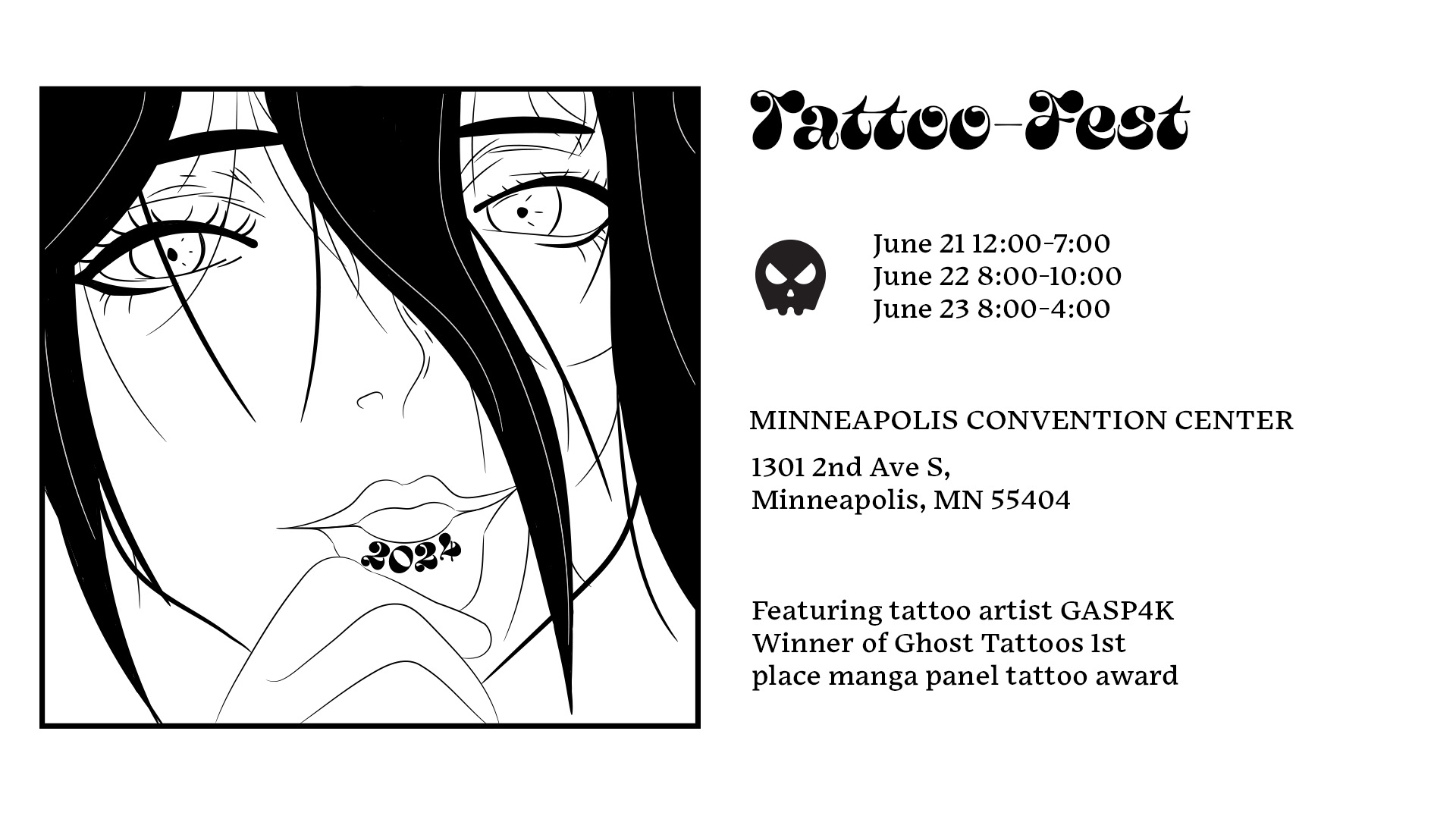
This was a simple redesign of the poster into a YouTube advertisement. Because they are designed to only appear on screen for five seconds, I made the text larger and easily legible to engage the interest of any viewers.
